A time-worn house regains its strength in
a project spirited by LOFTY INTENTIONS.
RIGHT Before, a common tract house offered amenities but no style on its garden side. | ABOVE The dining room tower dominates the garden façade. The upper level of the double-decker porch leads off the dining room and master bedroom to the stair. The lower level offers a covered outdoor area in front of the garage. Entirely resurfaced with stucco and wood shingle siding, the house is roofed with synthetic slate shingles and standing seam metal.
RIGHT Before, the raised ranch is a common house type in this neighborhood. | ABOVE Like its neighbors, the traditional street façade is simple. Grander details are saved for the expansive garden façade (see opening page). | INSET RIGHT The entry porch’s rounded arch is the first in a series that marks entry.

Additions & Alterations

Focus |
Whole House

Lofty Intentions

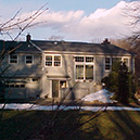
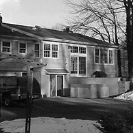
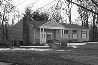
When prospective clients approach you to retrofit their
1950’s tract house with a timber frame roof system,
after a long pause and a deep breath,
you say, “When do we start?”

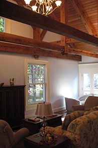
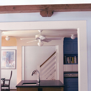
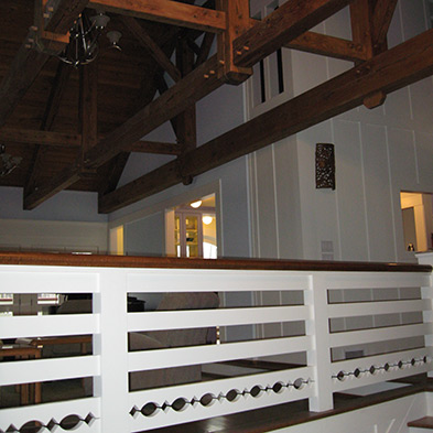
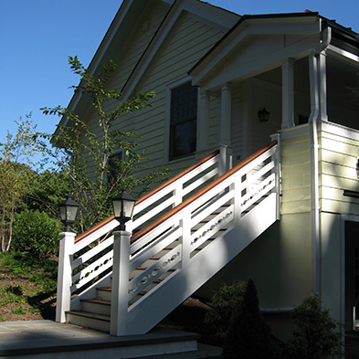
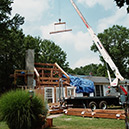
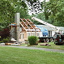
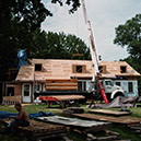
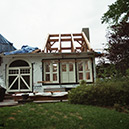
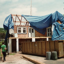
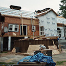
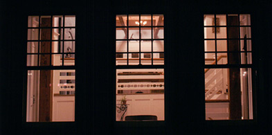
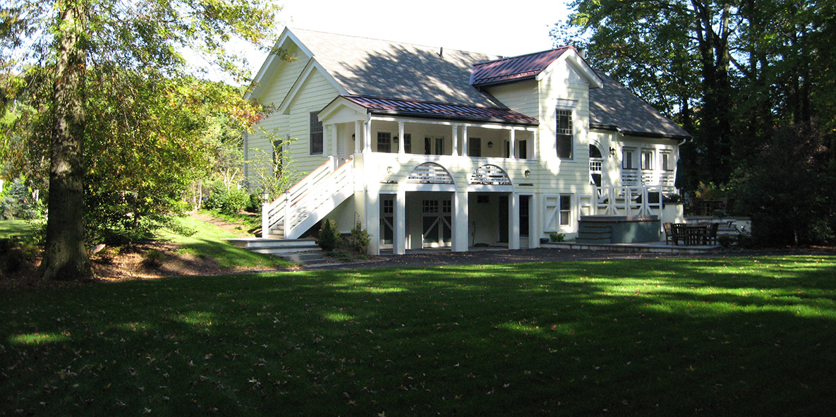
It all started with a sagging roof. With the stick-framed roof of his tract house caving in due to undersized rafters, the husband, a timber frame hobbyist, saw an opportunity to rebuild his roof with, as you may guess, timber framing.

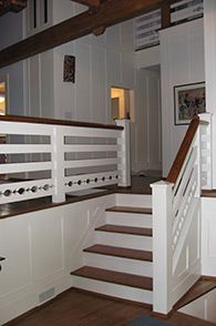
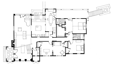
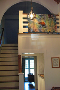
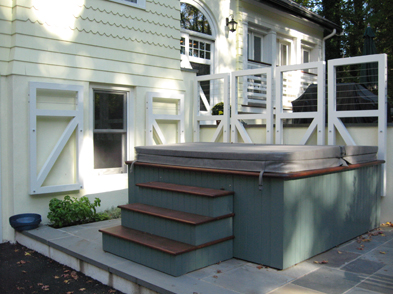
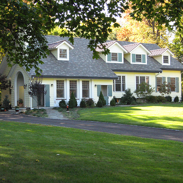
Besides sturdier framing, other practical benefits were gained by this restructuring. A new top floor offers room for future expansion off of a choir loft-like space at the head of a two story dining room. Better insulation in the roof keeps heating and cooling costs down.

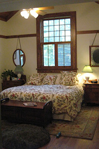
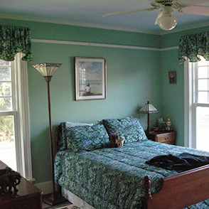
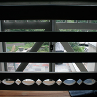
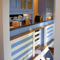
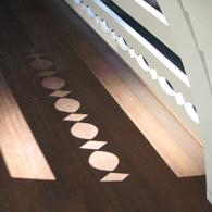
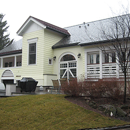
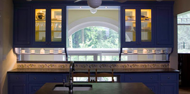
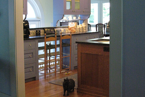
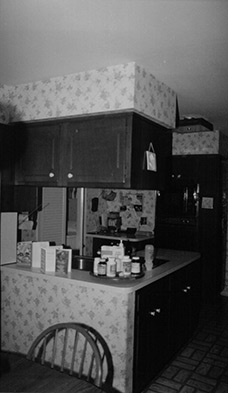
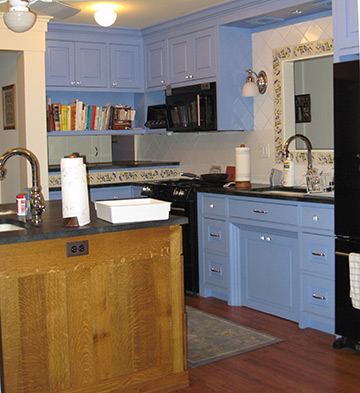
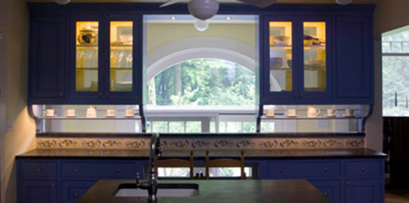
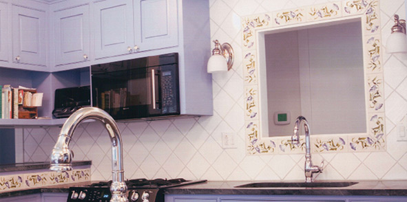
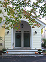
Many decorative goals were met as well. The wife asked me to breathe new life into the kitchen and bathrooms while reviving other rooms. The couple challenged me with intricate construction puzzles inside and out.

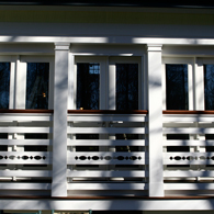
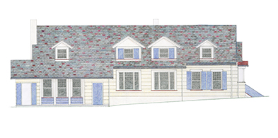
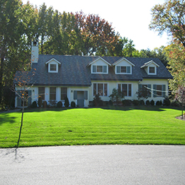
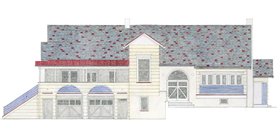
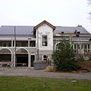
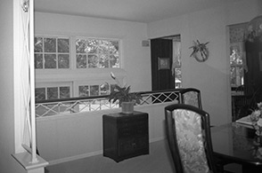
Aside from obvious technical concerns, I had nagging aesthetic concerns about imposing a massive timber frame on an unassuming house- would the results be all brawn and no beauty? At the heart of my concerns was my aching desire to convert façades into loyal followers of enlightened floor plans. On top of that, the homeowners heaped their wish to retain shiny contemporary furnishings that I just could not see among naturalistic timbers.

To sort through these bedeviling design challenges, I dreamt up a fable to reconcile opposing objectives. It reads like this: the house is a Craftsman style carriage house converted into a family home that combines Colonial Revival tenets with Modern leanings.

To provide a house with soul, I reflected on my fictitious history to fully engage burly timbers while keeping their assertiveness in check with the light hand of refinement. From sagging roof to home, sweet home: after a long renovative journey down a path of big ideas, lofty intentions took root in grounded results.


Additions & Alterations

1
2
3
4
5
6
7
8
9
1 Timber trusses fly overhead. Vertical battens break up the large expanses of wall board that would have appeared underdressed alongside tailored trusses. 2 At eye level, Colonial Revival trim around doors and windows softens the rugged demeanor of the timber frame above. 3 Before, the former dining room was turned into the kitchen. 4 A view through the new kitchen to the stair up to the dining room loft. 5 First Floor Plan: not much square footage was added. An expanded mid-level entry foyer is now large enough to greet visitors properly. The curious angle of its stair is echoed by the porch stair. The kitchen and dining room swapped locations to ensure that the family was not without meal-making facilities for long. The dining room extends into the garden as a double height hall from which the stair to the top floor ascends. 6 Before, the dark, cramped kitchen could not have foretold of its bright and roomy successor. 7 The arch of the loft marks entry to the mostly unfinished top floor. 8 Master bedroom’s oak trim matches the timbers. Picture hanging rails throughout avoid nail holes in the walls. 9 Vintage furniture feels right at home.


Additions & Alterations

Railing Against the Standard:

Creating Signature Style with One-of-a-Kind Railings
Common to houses from the simple to the sublime,
railings need not be commonplace.

Railings in a house make you feel safe and secure as you bound down the stairs or stand on a balcony taking in the view. Required by code to protect you from possible falls, railings are often used by architects for decorative effect. Lately though, the same railing seems to recur in one house after another: vertical sticks, either plain or shaped, surmounted by a serviceable handrail. When I can, I suit railings to a house’s style (see Railings in Details). Here, they weave a tale as they work their way in and out, up and down, inside and out.

ABOVE Set against a blue kitchen cabinet, the signature rail is a chain of cut out ovals and quirked squares. 1 Appropriately-scaled to hold its own against massive timber framing, the railing looks like the fancy fence that may have corralled the horses stabled in this would-be carriage house. 2 Light shines through the railing in an unexpected spot: the knee hole of the kitchen hutch. 3 Here against kitchen cabinets at the back stair, the railing runs in and out to unify the garden façade with an eyelet ribbon-like effect. 4 The railing creates a balcony-like effect at the living room doors. 5 Casting shadows: the cutwork railing at its best. 6 The porch stair railing terminates in light-bearing newel posts.
1
2
3
4
5
6


Additions & Alterations

Before and After

Picturing the Time-lapse Progression of a Changing House
By recognizing potential and transforming houses,
I play to Americans’ love of makeovers.

Scores of magazine covers and dozens of television programs make it clear that Americans love a good makeover. From getting the right haircut to shedding a few pounds, we are in constant pursuit of looking and feeling better. We want our homes to look and feel better, too.

If only I could turn a page or cut to the next scene to change a house instantly from the before to the after. In real life, improvements are made over time.

ABOVE LEFT Hand-rendering of street façade. 1 Before, the lopsided street façade. 2 Siding is stripped. 3 Most of my projects do not require cranes. 4 Timber frame takes shape. 5 Roof deck on, dormers built. 6 After: yellow-painted siding and green shutters complete the house.

ABOVE RIGHT Hand-rendering of garden façade. 7 Before, the garden façade’s hodgepodge of openings. 8 Timber frame appears dropped into the house. 9 Roof framing progresses from right to left. 10 Closed up, the house is porch-ready. 11 Standing seam metal roofing on porch and dining room tower. 12 After: The always sunny yellow house in the rain.
1
2
3
4
5
6
7
8
9
10
11
12


Additions & Alterations

X-Ray Vision:

Applying a Futuristic Notion to a Traditional House
A unifying theme gives substance to a house renovation
by putting a spin on the meeting of requirements.

In house design, a theme may be purely decorative, like basing a paint scheme on the colors of the ocean. Or a theme may be practical, like in this project where I used the theme of transparency to bring light into rooms without windows. Amused, family and friends smile at seeing through things that they ordinarily might not in a strictly traditional house.

ABOVE At night, light shines through distinctive cutwork railing that weaves along the back of the house. 1 Seldom remarkable, a sliding glass door seems apropos to this aspiring carriage house when dressed as a see-through barn door. Cutwork railing is visible through it. 2 Barn door-themed hanging trellises serve double duty as a guardrail for the raised terrace. Discreet wire railing strung between boards make them code compliant and climbing vine-ready. 3 Glass-fronted and -backed kitchen cabinets and an absentee backsplash let light through from stairwell. 4 The solid upper panel of the front door is made see-through by poking a window through it. 5 At hall’s end, electric privacy glass provides a view to the woods through, of all places, the bathroom. Glass turns opaque when the door is shut. 6 Patterns overlap in gridded window sashes and cutwork railings.
1
2
3
4
5
6


RIGHT Before, the dining room offered a perfect spot for a new kitchen. The swapping of the dining room with the kitchen reduced downtime of cooking facilities. | ABOVE The kitchen sits between the living and dining rooms. Soapstone counters top blue-painted cabinets that match the ceramic tile and stained oak cabinets that match the floors. | INSET RIGHT A close-up of the morning glory tile that set the kitchen renovation in motion.

Kitchens & Bathrooms

Focus |
Kitchen

Morning Glory

A pretty tile bought on impulse
inspires the design of this
ever-blooming kitchen

How could a single ceramic tile drive the design of an entire kitchen? When it’s the right tile, it’s not that hard to imagine.

Designers typically ask clients rather late in the building process to select tiles for their kitchen backsplashes. Ushered off to tile showrooms or home improvement centers, they may be overwhelmed by endless possibilities or underwhelmed by unimaginative stock patterns. Taking matters into my own hands, I looked through my tile samples luckily to unearth a particularly pretty tile.

Previous clients had introduced me to a line of hand painted tiles of pressed wildflowers (see Mighty Oak). Drawn to their casual beauty, I bought several just to have on hand. My favorite caught the delicacy and intense color of the ephemeral morning glory blossoms that climb my back yard fence every summer. The tile was an instant hit with my clients.

The rectangular shape of the tile lent itself well to several unusual conditions in the room I had planned. I set the height of the curb on an open-backed hutch so that a string of tiles could be installed end to end like a flower chain held captive by a soapstone counter top and ledge. Elsewhere in the kitchen, a difference in height between two adjacent counter tops left just enough of a gap for another short flower chain.

I sized a wall opening above the sink so that it could be framed by a precise number of full tiles, eight of which were mitered at the corners without cutting through a single bloom.

With the tile playing such a pivotal role in the kitchen’s design, I decided to echo it by painting the cabinets to match the blue blooms. The yellow color of the walls and ceiling works as if to provide sunlight to the flowers no matter the time of day.

Morning Glories are an annual flower. Here, forever captured in clay, they keep this kitchen blooming all year long.


Kitchens & Bathrooms

1
2
1 Before, the cramped kitchen was a thoroughfare on wash day due to the nearby laundry room. 2 The black glass-fronted range and refrigerator flank the food preparation sink in a bank of blue-painted cabinetry. The oak island holds a second sink convenient to dishwasher drawers. 3 The hutch is set against the back stair to the ground floor. To bring natural light into the kitchen and to provide an unobstructed view to the garden, upper cabinets were built with glass backs and a backsplash was eliminated in favor of a morning glory tile curb topped by soapstone to match the counter tops. 4 Morning glory tiles frame the opening above the sink.
3
4